Simple Worked Example
In the following pages, we'll create a simple bar chart, using the visual, some data, an inbuilt template, and Vega-Lite. Our finished visual is the bar chart on the left:
Our Starting Data
From the sample workbook, we'll use a single column and measure. Here's how this looks in raw form:

Here, the [City] column represents a nominal category, and [Mean Temperature] is a simple measure that computes the average temperature for the given row.
Try to think about the dataset you wish to add to a Deneb visual in terms of how it will work as a table visual. This will help understand the dataset's granularity and "think visually" when creating marks and layouts.
Adding the Visual
If you need assistance with this, refer to the Getting Started page.
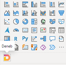
Once you have added Deneb to your report, you should see it in the Visualizations pane:
You can then click the visual to add it to the report canvas:
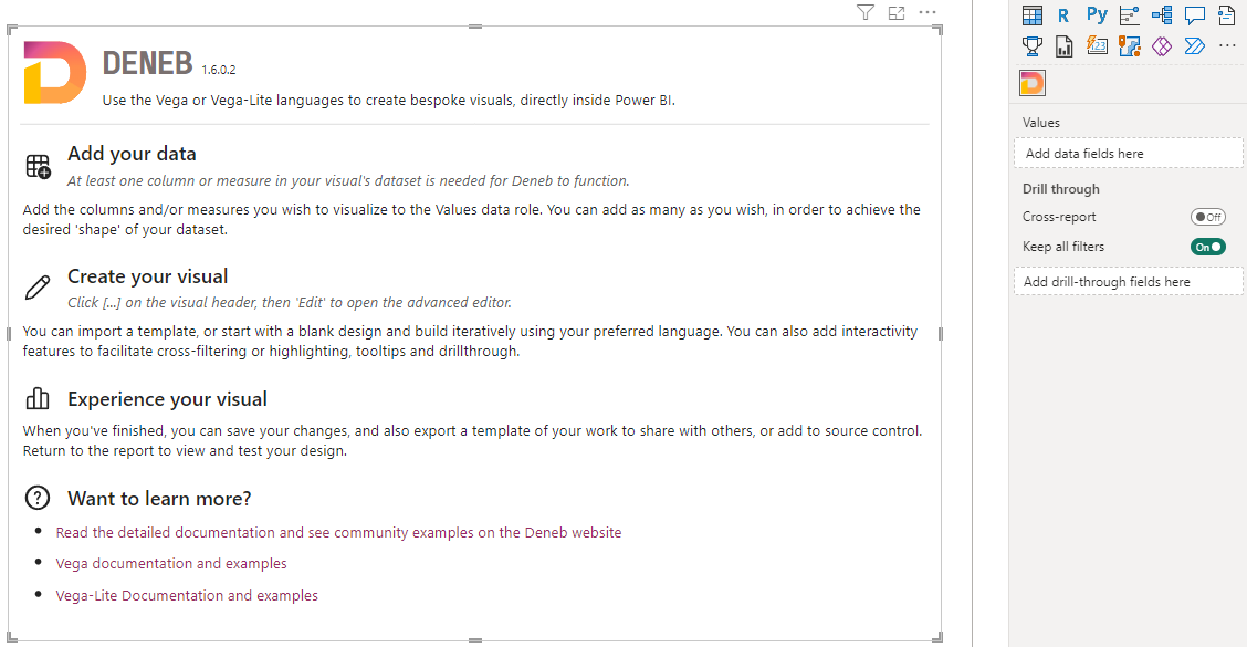
Adding the Data
We'll now add the [City] column and [Mean Temperature] measure to Deneb's Values data role:

At this point, we need to create a specification that instructs Vega-Lite (or Vega) on how your visualization should be rendered.
There is a limitation with custom visuals: at least one measure must be present in the visual dataset for it to persist properties back to the report for later retrieval.
Opening the Visual Editor
We can now open the Visual Editor by selecting the visual header (...) and then Edit:

This will display the Visual Editor in focus mode, and the Create New Specification dialog will be shown:
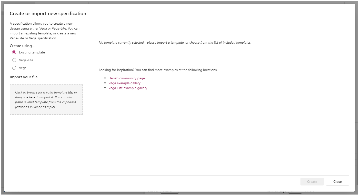
If you accidentally dismiss the dialog, or it doesn't show, you can bring it up by clicking on the New Specification button on the command bar, or using [Ctrl + Alt + N]
Selecting the Template
Using Vega or Vega-Lite requires a specification written in JSON. You can either select the [empty] template to begin editing with a bare-minimum specification with the dataset bound to it, or use a predefined template.
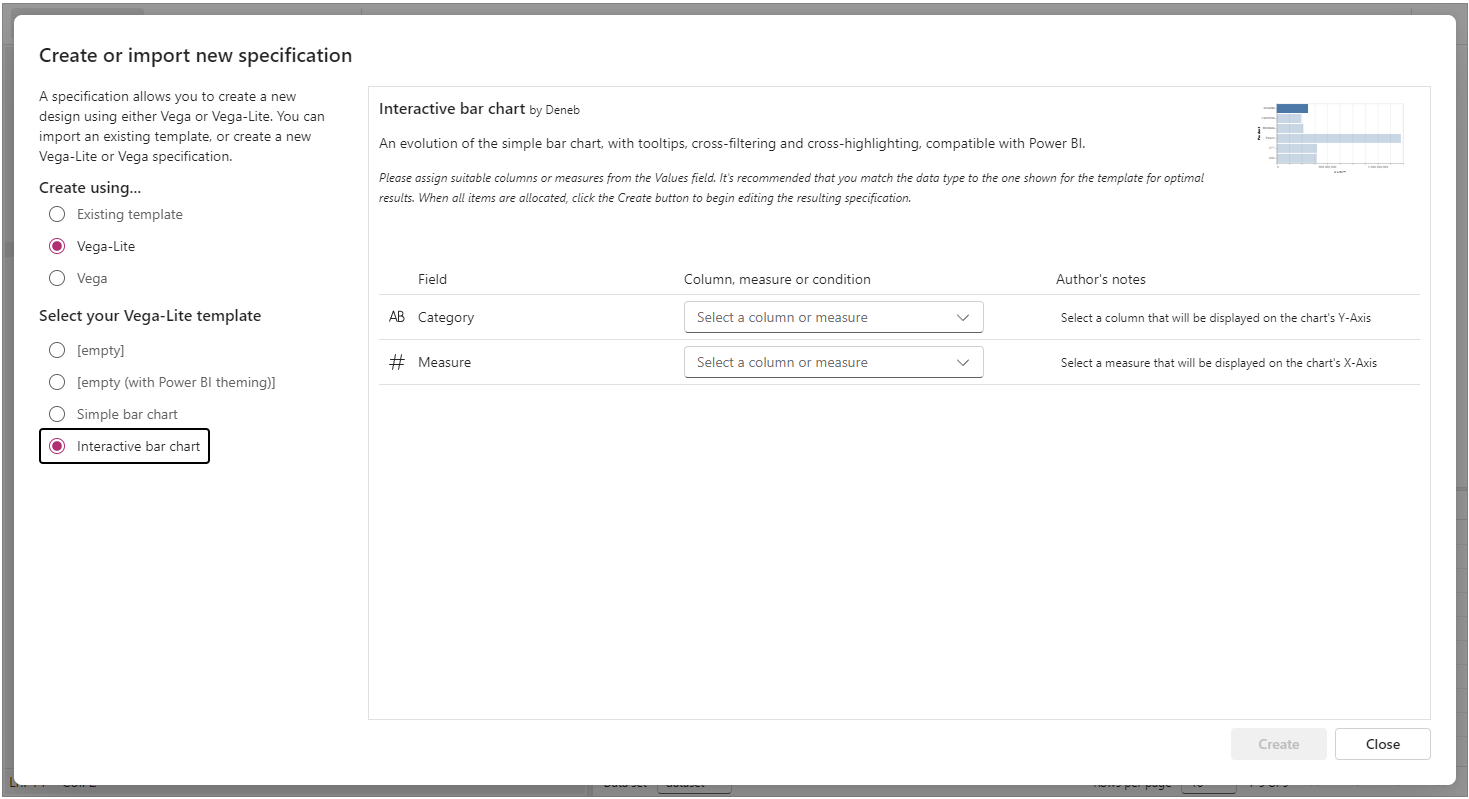
Let's choose Create using... > Vega-Lite > Interactive bar chart template by clicking on it. Note that we now get some additional details about the template, as well as some required placeholders:
Assigning Placeholders
This template expects two placeholders: one for the category axis and another for the measure axis. As we've already added our data, we can see these are already available in the dropdown lists:

In our case, we'll add City to the Category placeholder.
You can choose either the column or the measure - the recommended data type is shown next to each one so that you can visually confirm the right type of field to bind to the placeholder. Using a different type might work, but be prepared to make some changes afterward if you proceed.
Deneb can only see columns or measures added to the Values data role. This is a limitation of Power BI visuals, so they cannot know more about your data model than they are supposed to. You can add or swap out a column or measure if it's not the one you want, and the dropdown list will update accordingly.
Next, we'll click on the Measure placeholder and select the Mean Temperature measure:

Creating the Initial Specification
Now that all placeholders have been filled, the Create button is enabled:
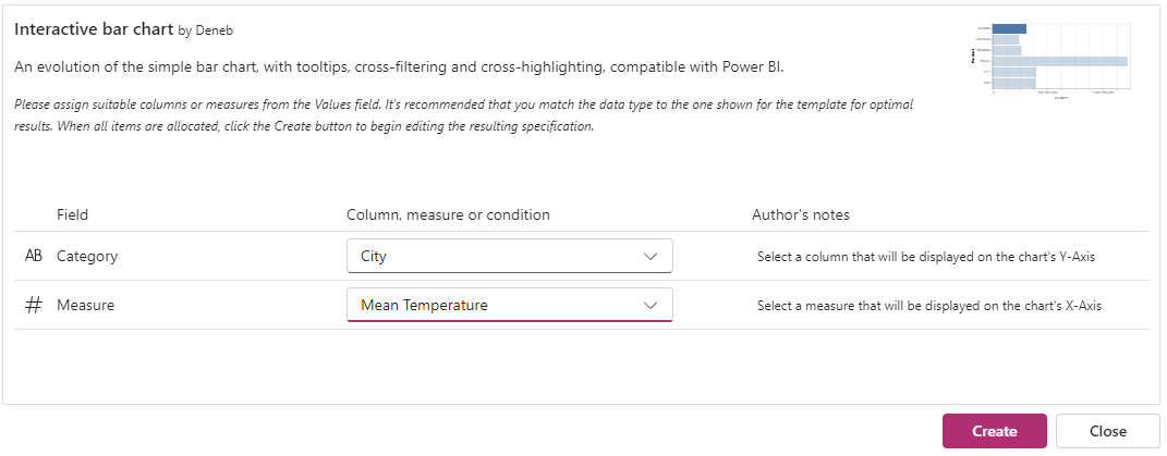
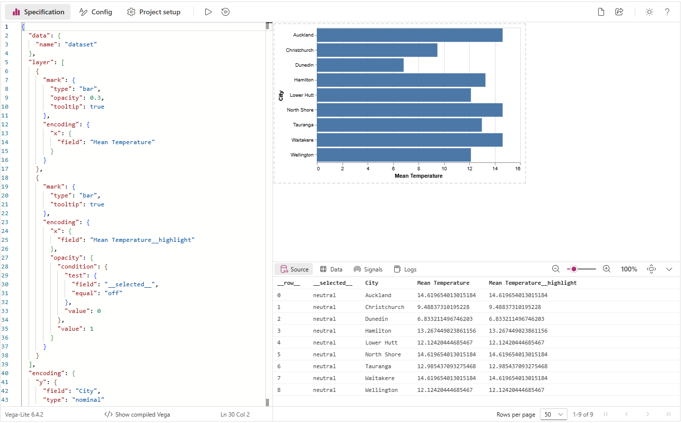
Clicking on this will show the visual specification in the Visual Editor with our assigned placeholders:
Reviewing Generated Specification
In our editor's Specification tab, we'll now have the following Vega-Lite JSON specification:
{
  "data": {
    "name": "dataset"
  },
  "layer": [
    {
      "mark": {
        "type": "bar",
        "opacity": 0.3,
        "tooltip": true
      },
      "encoding": {
        "x": {
          "field": "Mean Temperature"
        }
      }
    },
    {
      "mark": {
        "type": "bar",
        "tooltip": true
      },
      "encoding": {
        "x": {
          "field": "Mean Temperature__highlight"
        },
        "opacity": {
          "condition": {
            "test": {
              "field": "__selected__",
              "equal": "off"
            },
            "value": 0
          },
          "value": 1
        }
      }
    }
  ],
  "encoding": {
    "y": {
      "field": "City",
      "type": "nominal"
    },
    "x": {
      "type": "quantitative",
      "axis": {
        "title": "Mean Temperature"
      }
    }
  }
}
This breaks down as follows:
-
There's a
dataobject, which has a mapping of"dataset"(lines 2-4).- This is required for the specification, instructs that our visual's dataset should be used and should be left as-is.
- Refer to the Dataset page for more details on how this works.
-
We have a
layerview, which allows us to superimpose chart elements (lines 5-39). Within this layer, we have:-
One
barmark for each data point (lines 6-17).- The width (
xencoding channel) of this bar is bound to ourMean Temperaturemeasure (lines 13-15). - We're displaying a
tooltipfor this mark (line 10). - This is used to display original values in the event of a cross-highlight from another visual (more on this below)
- The width (
-
One
barmark for each data point that is bound to ourMean Temperaturemeasure's cross-highlight values in thexencoding channel (lines 18-38).- The
opacityof our mark (how 'solid' the color appears) is linked to a special field called__selected__, which manages cross-filtering for us (lines 27-36). This is also explained further below, so just bear with us for now.
- The
-
-
The encoding for the visual's top-level (lines 40-51) maps our data as follows:
Cityis mapped to the y-axis and is a nominal/categorical field (lines 41-44).- Our x-axis is a quantitative/linear (lines 45-49).
As noted above, this is a layered view, so we can show you how to make your visual work with Power BI's interactivity features in as simple a way as possible. Vega-Lite also has single, concatenated or faceted views as well, so it's worth checking those out (with their associated examples) to learn more.
We also have some other stuff going on in the editor's Config tab, thanks to our template...
Reviewing Generated Config
In our editor's Config tab, we currently have an empty JSON object:
{}
Config is there so you can apply specific cosmetic attributes to things in your specification without everything being tightly coupled. You can do this in your specification if you like, but abstracting as much as you can into this editor allows you to make cosmetic changes more easily. It's very versatile, and you can read more about it for each language in more detail on each documentation site (Vega | Vega-Lite).
One thing that's handy for Power BI - due to the ability to dynamically size visuals - is automatic sizing for simpler (single or layered) views - and this is automatically applied for you without needing to specify it.
By default, this template doesn't apply any config, so that you can learn what the defaults look like and build from there. Power BI does not always have sensible defaults for a lot of its core chart types, so you can learn a lot about what is available and how much you can customize by experimenting with this.
Initial Config for Our Visual
We will make some changes to this config to see how we might make a design look "at home" with the Power BI defaults. Modify the JSON as follows and click the Apply (▶️) button (or pressing [Ctrl + Enter]):
{
  "view": { "stroke": "transparent" },
  "font": "Segoe UI, wf_segoe-ui_normal, helvetica, arial, sans-serif",
  "axis": {
    "domain": false,
    "labelColor": "#605E5C",
    "labelFontSize": 12,
    "ticks": false,
    "titleFont": "din",
    "titleColor": "#252423",
    "titleFontSize": 16,
    "titleFontWeight": "normal"
  },
  "axisX": {
    "gridColor": "#C8C6C4",
    "gridDash": [1, 5],
    "labelFlush": false,
    "labelPadding": 5,
    "tickCount": 3
  },
  "axisY": {
    "grid": false,
    "labelPadding": 10
  }
}
Our visual will update with these cosmetic changes:
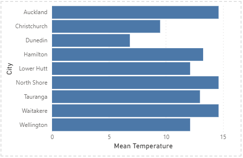
A brief summary of what this has done to our visual:
- We've removed the border (stroke) from around our plot area.
- We've set the general font to use Segoe UI. Note that here we have added fallback options for non-Windows devices.
- We've made a generic configuration for both axes to:
- Remove the domain (origin) line.
- Set the color and font size of the axis labels.
- Remove the tick markers.
- Update the title to use the DIN font, and style it accordingly.
- We have styled the x-axis as follows:
- We have modified the color and style (dash) of the gridlines.
- We have modified the distance (padding) of the labels from the domain, and made the start and end labels sit central to their grid line, rather than flush to them.
- We have specified a reduced density of the ticks, which will also affect the labels.
- The y-axis has the following changes:
- We have turned off the grid lines.
- We have increased the padding of the labels from the domain line (slightly larger than the x-axis)
If you want a more fully-featured config that matches Power BI more generically, you can create a new specification using the inbuilt [empty (with Power BI theming)] template, which uses the powerbi vega theme.
Further Bar Styling
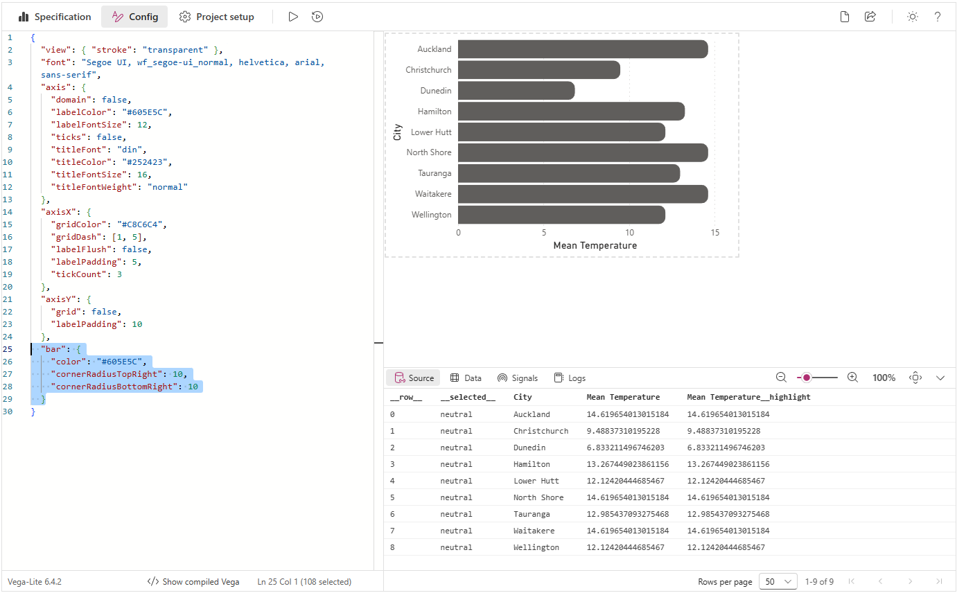
Let's make one more change, so that our bars look a little different from the conventional bar chart. After the closing brace on line 24, add the following:
{
  ...
  "bar": {
    "color": "#605E5C",
    "cornerRadiusTopRight": 10,
    "cornerRadiusBottomRight": 10
  }
}
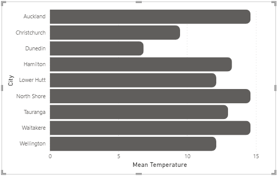
Again, let's apply our changes and see the results. Your visual should update as follows:
Interactivity Review
Some features of the specification and settings allow the visual to interact with others in the report. Interactivity is a more advanced topic, but the goal of this example is to show you the art of the possible. It's worth reading up on the interactivity features and understanding the quirks of Power BI and how Deneb tries to bridge these gaps (available in the sidebar), but a short overview of these features and how they are applied in our example is as follows:
Tooltips
Our template enables tooltips by default, so we can hover over a data point in our visual, and this will display a default tooltip:
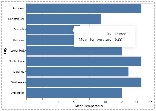
If we were to set up a tooltip page that included one of the columns from our visual, then the visual can resolve this, providing that you specify to use a report page tooltip instead of a default one:
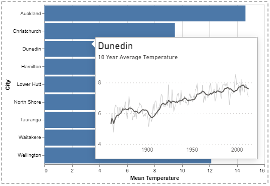
Note that report page tooltips will only work if your data point hasn't been transformed or mutated from the row context passed into your visual's dataset. When data points cannot be reconciled to the data model, the visual will display a default tooltip instead. Please refer to the Interactivity Features or Tooltips pages for further details.
Cross-Highlighting
Creators often enable cross-highlighting, which means that when another visual is clicked, other visuals adjust their display to show the highlighted values in context with their original values.
-
In our visual, we show the original values with our first mark.
Cross-Highlighting: first (less opaque) mark{"mark": {"type": "bar","opacity": 0.3,"tooltip": true},"encoding": {"x": {"field": "Mean Temperature"}}}This is 30% opaque and is displayed underneath the second mark...
-
...and the second mark is used to show the cross-highlight values.
Cross-Highlighting: second (solid) mark{"mark": {"type": "bar","tooltip": true},"encoding": {"x": {"field": "Mean Temperature__highlight"},...}}If no cross-highlight is applied, the data point values remain the same as the original, which obscures the mark behind it. This encoding uses the same measure, but with a
__highlightsuffix, which Deneb uses to provide the value we need to display. The rest of theencodingsection has been omitted as it's used for the next section.
It might be a bit much for a simple walkthrough, but you're likely here because you want to build your own visual that looks and feels at home in Power BI. Cross-highlighting is part of this journey, so we want to give you a simple way in. You can read in more detail in the Interactivity Features or Cross-Highlighting pages for further details.
Cross-Filtering
Many Power BI visuals allow you to cross-filter others by clicking (or Ctrl-clicking data points). We can also do this with Deneb, but there are elements of user experience that we need to consider: most Power BI visuals will dim or fade the un-selected data points so that our users understand what is happening between our visual and others.
This is normally opt-in, but our template already has a simple version of this set-up already. The relevant section of our specification is on lines 25 through 35:
{
  "mark": { ... },
  "encoding": {
    ...
    "opacity": {
      "condition": {
        "test": {
          "field": "__selected__",
          "equal": "off"
        },
        "value": 0
      },
      "value": 1
    }
  }
}
Deneb uses a special field called __selected__ to track the status of each row of our dataset. We can use this in our encoding, along with a test to set the opacity value of our mark to 0 (or hidden) if it is not one of those that we've clicked (or Ctrl-clicked) on, e.g.:
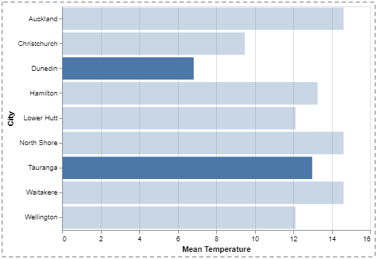
Note that much like report page tooltips, Cross-Filtering will only work well if your data point hasn't been transformed or mutated from the row context passed into your visual's dataset. When data points cannot be reconciled to the data model, this may not work as intended. You also need to manage the visual effects of your selected and unselected marks. Please refer to the Interactivity Features or Cross-Filtering (Selection) pages for further details.
Viewing the Finished Product
When you're finished, click Back to report to exit focus mode and return to the report canvas. Our visual will now be 'regular-sized', thanks to the automatic sizing that Vega-Lite applies for simple and layered views:
Where Next?
We've used one of the built-in templates to produce a simple example, and added some integration features in the form of tooltips, and customized its appearance using config. A simple visual like this is just the tip of the iceberg, and the way ahead is quite broad and expansive.
The purpose of this site is to provide details on how to make the visual work for you in Power BI, rather than repeating the wealth of great documentation already available. To learn more about the additional features the visual can offer (or understand its limitations), please continue reading or use the menu to explore further.
If you're hungry for more examples or further inspiration, then a good place to start is Vega-Lite's own gallery, or even Vega's gallery.